User: | Open Learning Faculty Member:
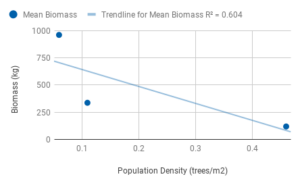
I decided to plot the relationship between population density and biomass of white spruces (n=30) that I found in my data. I calculated the biomass of all 10 replicates for each of the three sites (population density=0.46, 0.11, 0.06) using diameter at breast height (DBH;cm) and height (m), then calculate the mean for each site and plot it against population density. I originally wanted to plot all the biomass values, however I had trouble figuring out how to graph them due to the nature of my independent value. If I were to group the biomass values in terms of density, I am not sure how I would be able to compare the groups to each other. The outcome was generally as I expected, however it was less linear than I thought it would be. As you can see, my R squared value is only 0.604, so it is not a great fit for my data.