User: | Open Learning Faculty Member:
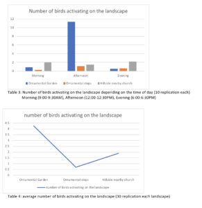
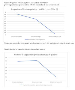
I have made 4 graphs in total to represent my observation for my research project. Graph 1 describes proportion of fresh vegetation per quadrat. The outcome turned out as I expected, the area that had least human management had the least healthy vegetation. While, the area that had most human management had the most healthy vegetation. Graph 2 describes the number of vegetation species found per quadrat. I assumed that there will be the most vegetation species on ornamental gardens and least on the preserved hill and the graph result showed somewhat different results. Ornamental steps had the most various vegetation species per quadrats compared to ornamental gardens yet preserved hill had the least various vegetation species growing in the landscape. Graph 3 describes the number of birds activating on the landscape depending on the time of day (10 replication each). This table demonstrated the bird activities depending on the landscape and time of the day. It was difficult for me to see overall trends of bird activity because the results were showing in so much detail in Graph 3. Therefore with the same data I made graph 4 to represent overall bird activity rate depending on landscape to observe easily. The activity of birds data revealed that did not expect when I started the experiment. I assumed that as ornamental garden had most healthiest vegetation, there would be the most bird activity among the landscape no matter what time in the day. However the results turned out that in the morning and evening the hillside church has the highest bird activities and the ornamental steps were the lowest all the time. This result lead me to a thought that bird activity might not be affected by healthiness of vegetation, instead it might depend on type of vegetations. Further exploration, I decided to study types of species generally found in all the landscapes.