User: | Open Learning Faculty Member:
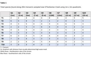
Making a table with my data was pretty straight forward. I added a totals section to my fieldwork tables and counted the number of species present in each quadrant. Transferring this information to a table was easy enough from there. After analyzing the data, made easier by line graphs of each individual transect, it was revealed to me that the pattern I was looking for was almost non existent. There were a couple of transects I sampled that seemed to support my initial observations and consequently my hypothesis that distance from the creek affects species diversity (After reading the textbook I realized I actually meant “species richness”). The majority of the transects sampled however had no discernible pattern between them. This goes to show the importance of sample size and repetition in scientific method. As far as further exploration, I would still be interested in what in what effect the creek has on species richness, but in order to find this out I would need to rethink the whole experiment and start from scratch. Perhaps requiring some comparison of near the creek vs not near the creek samples, and somehow controlling for other factors like slope, disturbance, sunlight, etc.
Nice post and definitely thinking about the right types of things that you might need to either measure / control. As well, 1m quadrats may make it difficult to capture shrub and tree diversity and work better for ground vegetation.