User: | Open Learning Faculty Member:
Given that I am working with data from 10 transects with 11 quadrats each, I had a great deal of trouble organizing my data. I took field notes in a Google Sheet and used Excel for calculations and data analysis from home. There were a total of 25 forb species found in the study area and I collected moisture, cover and species abundance data; therefore, (including empty sets) I have 2750 data points (10 x 11 x 25). It became clear very quickly that naming convention was extremely important when trying to arrange and analyze my data in a meaningful way. For example: I initially designated my quadrats as T1Q1, T1Q2… T10Q11 (with the number succeeding the “T” being the transect number and the number succeeding the “Q” being the quadrat number). However, when sorting data alphabetically, T10Q11 would be arranged between T1Q11 and T2Q1. Therefore, I had to go back and change my naming convention to T01Q01, T01Q2 etc. This seems like a simple thing, but it caused me a great deal of trouble and illustrated the importance of having “data management-friendly” naming conventions. I will note that this is, certainly, not the only time I needed to go through and “clean” my data in order to facilitated organizing it in a logical way.
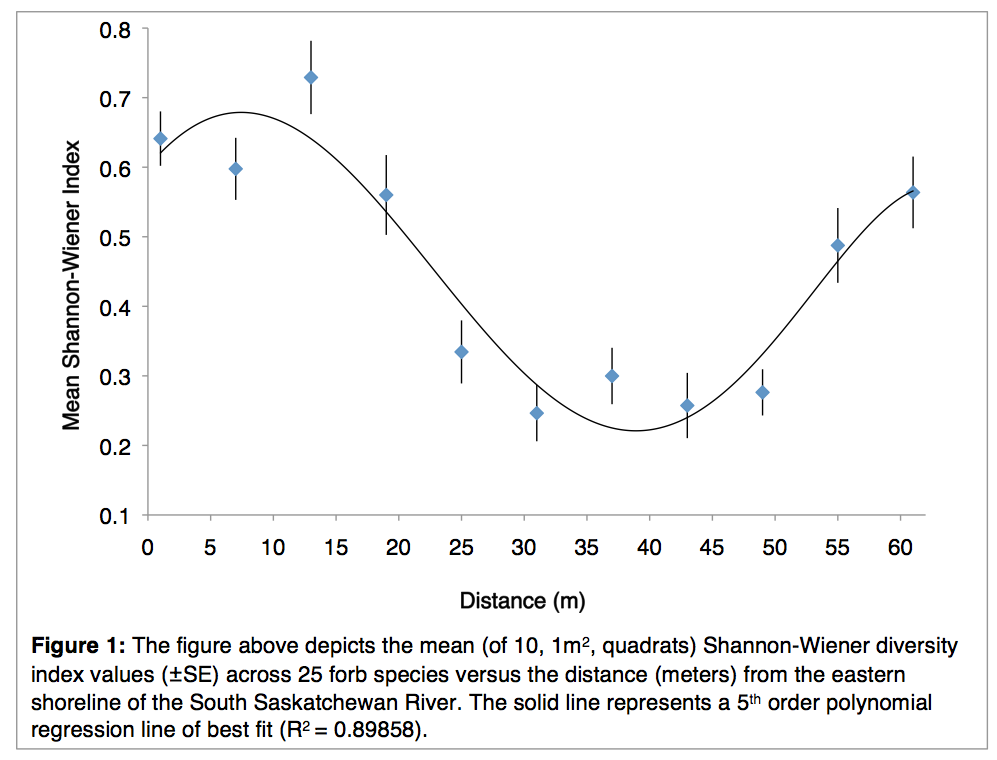
Concerning presenting my data: I struggled to find a singular figure that would readily summarize the overall trends in my project without being convoluted or confusing. Therefore, I decided to submit a singular graph of the the Shannon-Wiener Index against distance (from the shoreline of the South Saskatchewan River). I will also note that I did perform calculations for Simpson’s diversity index but have only included the Shannon-Wiener in my submission to avoid ambiguity.
I expected that forb species diversity would be highest at an intermediate area between the extreme ends (the shoreline and the uplands) of the riparian environment I was studying. While this is true (Figure 1), I was not expecting that the highest level of diversity would occur that close to the shore. In addition, I was not expecting that forb diversity would be so high approaching the uplands. While not pictured in this graph (again, for the purpose of keeping it understandable), soil moisture steadily declines and elevation increases as distance increases. But soil moisture, alone, does not account for the low diversity found from 25-50 m. Fortunately, I’ve also collected data regarding shrub cover (that I suspect limits forb species). I also have elevation data from each quadrat and am thinking about using it to calculate the steepness of slope gradient. As I was sampling my transects, I noticed that both of these factors seemed to relate to quadrats in which no forb species were found.
Regardless, I still have some statistical analyses to perform in order to know which results are significant.

