User: | Open Learning Faculty Member:
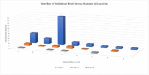
It is difficult to see the chart below, but it represents the values of individual birds documented, the number of humans/hikers that were present on that portion of the trail at that time, and it is separated by the three Locations A, B, and C which were observed. It did take some time for me to organize and rearrange my data into formats that would pull the information I was looking for. I did find it to be challenging, but also a learning experience. My data did reveal a few patterns that I was surprised by. It appears that the bird populations tend to be much more abundant at Location A regardless of human activity, which I was not expecting. The hiker traffic did not appear to have much impact on the bird behaviour. Though, this may have been because the hiker numbers always remained quite minimal .

