User: | Open Learning Faculty Member:
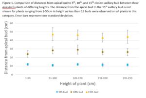
I have collected all of the data for my study on wild rose axillary bud spacing. I generated a figure for Small Assignment 5 to visualize key data. This figure displays plant height (the predictor variable) on the x-axis and the distance from the apical bud to the axillary buds (response variable) on the y-axis.
I originally had planned to show the distances for all 15 buds in the figure for each plant height category. I discovered that when all of this data was included the figure was messy and hard to interpret. By reducing the number of buds displayed to 3 (the 5th, 10th and 15th bud) visualization of the data points and error bars in clear. The inclusion of the data from the 5th, 10th, and 15th bud is a good representation of the full dateset and is sufficient to provide an appropriate visualization. The data from the other buds not represented in this figure may be displayed in a table in the report.
The creation of the figure provides supportive evidence for the prediction that axillary bud spacing is consistent regardless of plant height. The figure shows that at the 5th, 10th, and 15th axillary bud, the distance from the apical bud is easily within one standard deviation for all plant heights and no clear trends are displayed. These results suggest that there is an optimal spacing between the axillary buds for wild roses. For future research it would be worthwhile to further investigate what features have been optimized in wild rose crown architecture and what factors influence these features. For example I would like to investigate leaf size and location to measure the extent of self shading.