Blog Post #8

Below are the figures I created to summarize the results of my data collection:


My data was fairly easy to summarize with figures. I struggled with excel (as I don’t have much experience with the system) and creating the graphs took longer than it likely should have. However, for the most part, I think it went well.

 Looking at Figure 1 above, it can be seen that species diversity increases as distance from the creek increases. This supports my prediction for the most part, however, I did expect 8 m from the creek to have a greater diversity than 6 m. Looking at my data, it appears that 6 m from the creek is where plant diversity begins to drop off. It is possible that the area right next to the walking trail usually supports a larger number of species, but that anthropogenic influences such as spraying chemicals and mowing have decreased this number.

Looking at Figure 2 A through N, it can be seen that while some species grow all over, others appear to have a preferred distance from the creek in which they grow. Besides grasses, Elymus canadensis and Trifolium repens were by far the most common species and were able to survive in all transects. Graphs F through N show that some plants had specific living conditions. None of them were present in quadrant 4 and some were also not present in quadrant 3. These plants likely do not have the adaptations necessary to survive flooding. There were also some that only grew within a certain quadrant, such as Plantago major (that only grew in Quadrant 1) and Aristida purpurea (that only grew in Quadrant 3). As I continue with my research, I will look into what specific conditions (besides flooding) make these quadrants ideal for these plants. As I continue to analyze my data, I plan to calculate and examine the correlation between distance from the creek and plant diversity. 
Blog Post 9: Field Research Reflections

I am so glad that I took this course, although it was incredibly challenging for me. I have conducted several wildlife studies, habitat assessments, etc., however, I have never designed one. I spent the whole summer collecting data, and I have a greater understanding of how difficult it is to come up with and test a hypothesis. I changed my focus NUMEROUS times-the world is a big place, and narrowing down just WHAT to study was the most challenging. I am finalizing my research paper, and seeing all my data in one place is incredibly rewarding. I adore being out in the field, and I plan to repeat this study for my day job next year, with some changes-I made a LOT of mistakes along the way, but I do believe you learn more from your failures.

Blog Post 8: Tables and Graphs

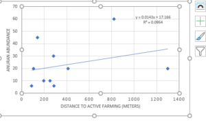
I conducted a call survey at 10 locations throughout PEI. The information I gathered was a bit challenging to piece together to present it in a meaningful way. I took 5-minute recordings at each location, then listened later, and assessed abundance based on the calling. I am fortunate that my day job allowed me access to a YSI meter to collect nitrate levels at each of the locations. I then used mapping software to measure the distance from each calling site to the closest active farming site.
I am presenting my nitrate levels at each location in a table. I plotted my distance to farming (independent variable) on my X-axis and the number of anurans on the Y-axis (dependent) variable. The correlation to farming and species abundance that I predicted, does not appear to exist. PEI has been more involved in the past 20 years of restoring wetlands, establishing guidelines, and enforcing best management practices for the farming industry, which is a possible explanation as to why there is no correlation. I am hoping to return to my same job next summer as a wildlife technician and using this framework to set up another abundance study, to include all amphibian species on the island, not just anurans.


s

Blog Post #7 Theoretical Perspectives

The basis for my research on amphibians, specifically frogs and toads (anurans) on Prince Edward Island, is that our landscape is predominantly farming, with the majority of that farming being potato farming. My research has been to study the abundance of four species of frogs and one species of toad. These anurans only call during mating season, and are most active after sunset, so I went out to ten locations during their mating season to assess abundance. I chose 10 sites at random, however, I did have to choose the sites based on their ability to host frogs and toads-freshwater, riparian zones. I was curious to see if there was a relationship to active farming sites and species abundance. I am pretty sure that my research will show no correlation-of which I am pretty upset about, as I based my whole summer on this. I will endeavor to show that BMP (best management practices) may have something to do with this, as we had our mandatory buffer zone increased to 15 meters in 2005. My research keywords would be

Anuran, farming, buffer zone

Blog Post 5: Design Reflections

When I went into the field to start implementing my field strategy, I didn’t feel as if I had any major difficulties as I had prepared well before going into the field and had the appropriate tools needed. I think where the difficulties have now arisen is in my confusion of understanding the process. I chose to use a distance-based method (as this is used for stationary organisms, such as trees) and to use the simple nearest individual method as mentioned in Module 3 Sampling Techniques Tutorial.

I then used the Vegetation Resources Inventory (VRI) Ground Sampling Procedures from the Ministry of Forests and Range, which was extremely detailed and helpful, to supplement my understanding of the sampling strategy. I ended up implementing an integrated plot centre (IPC) quarter method which is what is now confusing me, as I am unsure if my sampling strategy is correct. My IPC was randomly chosen by splitting the area on the west side of Lost Lake into 16 zones then by using a randomized number generator to choose the zone. From here I used google maps to collect my coordinates to implement my sampling strategy.

I sampled 16 trees in total, four at the IPC and four at each auxiliary plot that are 50 metres north, south, east and west of the IPC. I was unable to sample at the eastern auxiliary plot as this was located in the middle of Lost Lake. At the IPC and the auxiliary points, I quartered the area using cardinal directions, into 4 sections. In each quarter I measured the DBH of the nearest individual (4.0 cm DBH) and measured the distance to the centre point.

Using the VRI ground sampling procedures it actually gets quite complicated for the quarter method as the data that I am trying to collect is tree attributes and the recommended sampling methods are fixed-radius or variable. When I dig further into this, variable plot is a method in which sampling area (plot size) varies with tree diameter and fixed-area, is exactly that, and you need to determine which trees are in or out based a fixed-radius.

To modify my approach, I may need to increase my sample size or alter my methodology. Either way, I plan to use tree attribute cards that have been provided in the VRI ground sampling procedures to help collect data clearly. I also need to document my access point, tie point and reference point. As I am in a municipal park I am unable to leave permanent objects or markings in the forest. Instead, I will look for obvious landmarks or unique trees that can act as these points. I also need to assess if I should replace my dropped auxiliary point, but this also answers if I should increase my sample size. All of these discussed modifications will improve my research to be standardized, repeatable and with little bias as possible.

Blog Post #7

My hypothesis is that flooding has an effect of the variety of plant life growing alongside a creek. Ecological processes that my research project may touch on are the impact of flooding on plant life, adaptations that allow some plants to survive flooding, and competition for resources along a creek/river side gradient. Other ideas my project may relate to are soil moisture and sun exposure. I could also look at the effects of melting snow in the spring and excess rain on plants living near moving water.

Three key words that I could use to describe my research project are flooding, creekside vegetation, and competition.

Blog Post #6

Given the results of my initial data collection and the advice I recieved on my sampling design, I have decided to change a few things about my project. 

My hypothesis is that flooding effects the composition of plant species along the creek. I predicted that the plant species composition would increase as distance from the creek increased due to the plants furthest from the creek not having to endure the harsh spring flooding.

I have fifteen transects, each 10m from the last, along the creek. Within each transect, I placed my 1m2 quadrat four times:

Q1- Within two meters from the walking trail.

Q2- Two meters into the bush.

Q3- Four meters from the trail and four meters from the creek.

Q4- Within two meters from the creek.

I completed my data collection today. My sampling design was easy to implement for the most part. However, some areas near the creek were quite steep with thick bush. It was difficult to be accurate with my measurements when collecting some of the Q3 and Q4 samples, but I tried to keep it as accurate as possible. 

My data seems to support my prediction for the most part. Q4 only had 5 different plant species in total and Q3 had 9. However, Q2 and Q1 both supported 13 different species, suggesting that four meters from the creek is when plant composition begins to drop off.

Blog Post 5: Design Reflections

My initial data collection day went as planned and I was able to implement my sampling strategy with relative ease, despite plots landing in black hawthorn bushes and one plot that was inches away from a large hornets nest! I brought along an assistant (my wife) to help with note taking and tape measure holding which aided in the process.

The soil texture results were as I thought they would be with courses texture results on the steep slope section, with the exception of one plot out of a total of 20. Given my successful experience implementing my initial data collection I intend to continue subsequent data collection in the same way.

A possible modification I may make is the spacing of my plots and transect lines. Currently transect lines are spaced 10m apart with plots every 15m on each transect line. I insured that I evenly captured both the gentle and steep slope sections, however, I wonder if I should attempt to cover a larger total area. I could do this either by allocated more distance between transect lines and/or between plots.

Blog Post 8 – Tables and Graphs

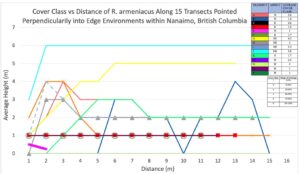
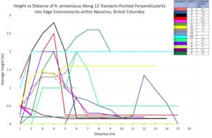
I ended up organizing my data into two graphs containing dependent variables of cover class and average height, and then distance along the transect in meters was the independent variable for each plot. Since I had 15 transects with a maximum of 15 1 m2 quadrats along each transect. My data lined up nicely using distance on the x-axis, but I had to use 15 separate colors, and it took some time to organize the colors and create a legend. One interesting observation from plotting the data was noticing how pervasive Himalayan Blackberry is around Nanaimo. I also noticed how spikes in data occurred around my perceived edge environment in most transects.

mean average height and cove class of R. armeniacus was 0.9 m and 2.09 respectively across all transects. I also saw minimum values of 0 for height and cover class and maximums of 2 m and 6 (95 – 100%). Median values across all 15 transects were also 0.7 m and 1.7 (19%).

In hindsight, I would have chosen 5 to 10 plots along slopes with different aspects and incorporated stand direction into my hypothesis. I also did all of my samplings on the same day so growth was similar across the field site, but if I did the project again I would organize another sampling day a month later.


Post 2: Sources of Scientific Information

A. The source of scientific information is a book entitled Practical Field Ecology: A Project Guide.

Wheater. C , Bell. James, Cook. Penny. (2011). Practical Field Ecology: A Project Guide. Wiley-Blackwell. West Sussex, UK.

B. The source is academic, non-peer reviewed material.

C. Following the tutorial for this module: ‘How to Evaluate Sources of Scientific Information’,  The first step is determining if the material is academic. To determine this, the tutorial has 3 criteria, all must be true. 1) the source must be written by experts in their field. 2) the source must have in text citations. And 3) The source must have a reference or bibliography section.

It is written by 3 authors who are each experts in their respective fields. At the time the book was published, Wheater worked in the department of Environmental and Geographical Sciences at Manchester Metropolitan University; Bell specialized in Plant and Invertebrate Ecology with Rothamsted Research in the UK; and Cook worked in the Faculty of Health and Applied Sciences at Liverpool John Moores University.  The book contains in text citations throughout and has a references section at the back. These three qualities make the book an academic source.

The next question to ask according to the tutorial is: was the material peer reviewed?

The acknowledgements section references many people who assisted in the writing of the book or participated in the required research in some way. However, there is no indication that it was peer reviewed with the possibility of being rejected prior to publication. The publisher does not claim that the book is peer reviewed either. The above points indicate the book is non-peer reviewed.

If the material were peer-reviewed, then the type of peer-reviewed material – research or review could be determined. As the source was not peer-reviewed, it cannot be research or review material.