Blog Post 8: Tables and Graphs

My research project is examining the expansion of a stand of Trembling Aspen Populus tremuloides into a field at Campbell Valley Park in southwestern BC. I chose to use the point quarter method to determine the density of 2 size categories of aspen trees along a transect, so I had a lot of measurements documented as part of my field data.  I took all of the measurements and followed the point quarter method directions from an article (Mitchell, 2007) I found describing how to sample as well as analyse the data. For the graph that I submitted I calculated the average distance to each of the sampling points along the transect and then squared that number and the inverse of that number equaled the trees per m2. I decided to graph these values as I thought they would show the density of the different size Aspen trees from the field, into the forest. When I originally started my project, the trees had full leaves and the forest was lush and full and the soil was drier compared to the winter with wet soil and no foliage. Reviewing my original hypothesis, the data I collected does not appear so far to support that the Aspen stand is expanding into the field as there were smaller trees dispersed along the transect. I did notice that the soil was absolutely saturated in some sections and I want to explore if the data show anything when compared to that.

References:

Mitchell, K. (2007). Quantitative Analysis by the Point-Centered Quarter Method (pp. 1–34). Hobart and William Smith Colleges. http://faculty.wwu.edu/wallin/envr442/pdf_files/PCQM.pdf
Blog Post 8: Tables and Graphs

I had a hard time organizing and summarizing my data.  I thought that it would be easier to place the information in a table than it was.  After looking at it a little more I think that I will try to find a different way to organize it that is easier for the reader.  I realized after sending the assignment that the way I organized it (by transect and quadrant) did not rely the information that I wanted it to.

I changed the table by creating three tables to show the mean pH and plant diversity of each transect distance.  I also made sure to write down every species that was present.  This new format made it easier to see which species were only present at certain distances as well as which distances were more acidic and diverse.

The outcome of the data surprised me.  There were several species only present beside the walking path and several that were only present 10-m into the bog.  I also expected to see more Sphagnum moss but it was only present in 11/30 quadrants; I wonder if that is because there was disturbance near the path.

Post 8: Tables and Graphs

The graph was relatively painless to create as I had set up the data with clear predictor and response variables and had produced a graph predicting the results when I was developing the methods and determining the hypothesis. The most difficult part of creating the graph was coming up with a descriptive title for the graph and labels for the variables.

The outcome of the graph was as predicted and supported my hypothesis. In general, the data did not reveal anything unexpected with the exception of an insignificant result from four data points where the fern frond was eaten by something. When I was averaging my data, I removed these data points as they added factors that were outside the experimental design. It is interesting, however, that the eaten fronds were only found in the partial shade and shaded conditions, which leads me to think that maybe the organism that ate them only lives in shaded forest areas. To investigate further I would need to look at more fern samples and see there were more ferns eaten as well as look for the organisms that eat ferns.

Post 8: Tables and Graphs

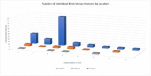
It is difficult to see the chart below, but it represents the values of individual birds documented, the number of humans/hikers that were present on that portion of the trail at that time, and it is separated by the three Locations A, B, and C which were observed. It did take some time for me to organize and rearrange my data into formats that would pull the information I was looking for. I did find it to be challenging, but also a learning experience. My data did reveal a few patterns that I was surprised by. It appears that the bird populations tend to be much more abundant at Location A regardless of human activity, which I was not expecting. The hiker traffic did not appear to have much impact on the bird behaviour. Though, this may have been because the hiker numbers always remained quite minimal .

Blog 8: tables and graphs

Because of time and weather constraints, I had to work with very little data. However, with what I was trying to accomplish, the collection of data was fairly straight forward and deciding on a visual representation took me a little longer. I was initially going to just keep a table with my figures because my variables are mostly categorical, but I was able to create two of the 3 variables that were most important. The data does not show a pattern at all so it did generate more questions and these will be explored in my discussion. I was disappointed that there was no significant pattern, but this might be explained due to flood disturbances over my ecotone gradient of the site.

Creating the graphs was challenging because I also had to learn how to use excel and trying to figure out how to create a table that can be converted into a graph the way I wanted. In the end it worked out pretty good.

Post 8: Tables and Graphs

I do not feel that I had any trouble organizing my data. I would have liked to be able to more accurately measure the thickness of the green layer in the bark but lacked the needed equipment. I would have also liked to sample more locations but without a way to travel into the forest in the snow it was not possible. The data I was able to collect was fairly straightforward to organize as I was just measuring the presence or absence of the green color on the trunk of the tree. I was surprised by some of the data that I collected. I found that while most of the trees sampled had green only on the south side as I predicted, some had green all the way around the tree while others had none visible. I also found that elevation could be a factor in the amount of green as the trees sampled from higher elevations had a deeper color of green likely indicating a thicker layer of chlorophyll. This could be due to the harsher conditions and increased length of winter present at the higher elevation. Further exploration would be useful to determine if there was any impact due to the clonal nature of aspen trees. It could be that some trees did not have any noticeable green pigment because some of the surrounding trees with better access to sunlight were supplying other trees in the family group with energy. I would also like to further investigate if the age and circumference had any relation to the color. I did notice in my results that the smaller trees were a darker green as well as being green further up and down than the bigger trees. This could be due to their smaller root system and not having access to as much of the surrounding resources as the larger, more established trees.

Post #8: Tables and Graphs

Everything surrounding the process of making the graph was straightforward and I knew already what kind of graph would best summarize my data, so all of this was smooth sailing. However, I was rather surprised when I saw the final result of my graph. I had an idea of what I thought the pattern should look like from the assignment earlier on in the course, but when I collected my data I thought there was no way my graph would even come close to replicating my prediction. I was ready to reject my hypothesis and was gearing up to take my study in the direction of exploring the other variables of why this hypothesis had no effect. However, upon seeing the final result of my graph I noticed that it was not anywhere to a close replicate, but the data did somewhat behave as I thought it would. Rather that moving in a smooth bell shape, it spikes up and down a little more than I thought, and I would love to find out what other variables were causing that reaction among my quadrats. And although it was a little more rigid, it does more or less follow the predicted pattern of starting moderately, rising and then descending to the lowest part of the graph. That realization was quite exciting for me! It made me really want to dive deeper into the other factors at play on this species in this ecosystem, as well as made me more fascinated by the cattails themselves.

All in all, I’m feeling very grateful for this class and this project for giving me a new curiosity in this field, and I’m very eager to finish the rest of the project and the class.

Post 8: Tables and Graphs

When creating my graph, I found it hard to properly display the diverse content I was recording neatly in one space. When attempting to create separate graphs, they showed no correlation with the point I was trying to prove. Upon its completion, I found it lacking in the specifics while not being laid out the way that was expected for the course. I was able to show the correlation between my points of research and the topic I am studying. My data was lacking water pollution and land pollution levels that I could not measure with current equipment. I feel that would provide a more accurate picture of long term effects of pollution on creek health.

Blog Post 8: Tables and Graphs

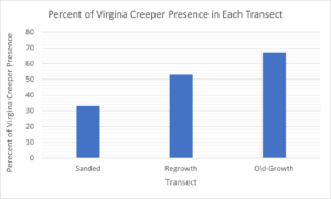
Originally, I struggled to discern the most appropriate way to present the presence or absence of Virginia creeper data that I had collected in my samples. However, once the data was converted to the average of Virginia creeper presence in each transect and presented in a bar graph, the findings became clear and easy to compare. Moreover, while writing my final paper, I found it difficult to present findings that were free of interpretation.

Overall, the findings supported my original hypothesis that Virginia creeper is negatively affected by anthropogenic activity. However, during my research of Virginia creeper characteristics and growth patterns, other underlying processes were brought to my attention such as if Virginia creeper had a stronger presence given a more nutrient-dense soil, in areas that facilitated more precipitation or more sunlight, or how the competition of other plants affected growth. Additionally, it would be interesting to observe the Virginia creeper over a longer period of time to better understand growth patterns in the sanded area and regrowth area. The results in these two areas could potentially differ more drastically and alter my findings if Virginia creeper was given more time to grow and disperse. Finally, it would be ideal to measure Virginia creeper growth in a controlled setting to obtain a better understanding of the impacts of anthropogenic activity on presence versus areas left undisturbed.


Figure 1: Graph of Virginia Creeper Presence in Each Transect

This graph illustrates the percentage of presence of Virginia creeper in the sanded, regrowth, and the old-growth areas.

Blog 8

Blog Post 8: Tables and Graphs

Create a blog post discussing your table or graph. Did you have any difficulties organizing, aggregating or summarizing your data? Was the outcome as you expected? Did your data reveal anything unexpected or give you any ideas for further exploration?


I had some difficulty with aggregating my data. I changed my design methods throughout, as I discovered what wouldn’t work. I finally gathered enough data and made a scatter plot to investigate correlation. I then did a Pearsons correlation calculation and it showed a strong correlation value. As with most research though, it created more questions. My research review indicated that poison ivy preferred sun over shade. Most of the plants however were located in part shade. I justified this based on the correlation to fruit bearing plant locations. I had predicted that the seed eating birds that dispersed the fruit seeds, also dispersed the poison ivy seeds in the same area. The strange thing is that there is NO poison ivy at all, just across the trail, only a few paces and this area is full sun and so preferable to growth. It seems strange that birds wouldn’t have at least dispersed some seed on that side of the trail. I wonder if maybe there is another unknown variable stopping it from growing on that side. I think that next year, just for my own interest, I will check it out and see if the distribution is still the same.