Blog Post 8: Tables & Graphs

I had some issues with aggregating my data as this is my first time working with scat as a response variable. First, I had to figure out how to quantify the average of all replicates collected for the response variable. I decided to divide the total number scat (one scat being defined as one pile of white-tail deer droppings) for each terrain type by the total number of replicates (i.e. quadrats). Thereby, I was calculating the average scat amount per quadrat (1m2) for each terrain.

The outcome was as I expected, with a higher average of scat per 1m2 for the open-grass area. However, the difference between the two areas was not as large as I first predicted. I need to conduct statistical analysis to determine if the difference was significant.

Blog Post #8

Below are the figures I created to summarize the results of my data collection:


My data was fairly easy to summarize with figures. I struggled with excel (as I don’t have much experience with the system) and creating the graphs took longer than it likely should have. However, for the most part, I think it went well.

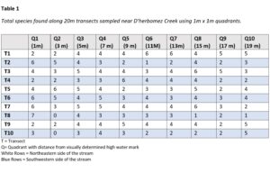
 Looking at Figure 1 above, it can be seen that species diversity increases as distance from the creek increases. This supports my prediction for the most part, however, I did expect 8 m from the creek to have a greater diversity than 6 m. Looking at my data, it appears that 6 m from the creek is where plant diversity begins to drop off. It is possible that the area right next to the walking trail usually supports a larger number of species, but that anthropogenic influences such as spraying chemicals and mowing have decreased this number.

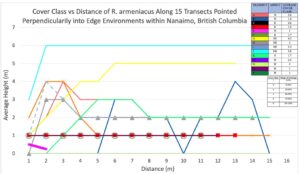
Looking at Figure 2 A through N, it can be seen that while some species grow all over, others appear to have a preferred distance from the creek in which they grow. Besides grasses, Elymus canadensis and Trifolium repens were by far the most common species and were able to survive in all transects. Graphs F through N show that some plants had specific living conditions. None of them were present in quadrant 4 and some were also not present in quadrant 3. These plants likely do not have the adaptations necessary to survive flooding. There were also some that only grew within a certain quadrant, such as Plantago major (that only grew in Quadrant 1) and Aristida purpurea (that only grew in Quadrant 3). As I continue with my research, I will look into what specific conditions (besides flooding) make these quadrants ideal for these plants. As I continue to analyze my data, I plan to calculate and examine the correlation between distance from the creek and plant diversity. 

Blog Post 8: Tables and Graphs

I conducted a call survey at 10 locations throughout PEI. The information I gathered was a bit challenging to piece together to present it in a meaningful way. I took 5-minute recordings at each location, then listened later, and assessed abundance based on the calling. I am fortunate that my day job allowed me access to a YSI meter to collect nitrate levels at each of the locations. I then used mapping software to measure the distance from each calling site to the closest active farming site.
I am presenting my nitrate levels at each location in a table. I plotted my distance to farming (independent variable) on my X-axis and the number of anurans on the Y-axis (dependent) variable. The correlation to farming and species abundance that I predicted, does not appear to exist. PEI has been more involved in the past 20 years of restoring wetlands, establishing guidelines, and enforcing best management practices for the farming industry, which is a possible explanation as to why there is no correlation. I am hoping to return to my same job next summer as a wildlife technician and using this framework to set up another abundance study, to include all amphibian species on the island, not just anurans.


s

Post 8: Tables and Graphs

The graph i submitted displays the data from one of my 4 sample plots (Plot 3). The predictor variable, elevation from the lake waterline, is presented on the X axis with the response variable, species composition (by percentage), on the Y axis. The sample plot was divided into 5 elevation zones, which made it easier to determine changes in species composition as elevation increased. This also made the data relatively simple to organise and graph. I took the raw data from each of these elevation zones and calculated the percentage abundance of each of the species in each zone. While the other 3 sample plots produced results that aligned closely with my prediction, the results from Plot 3 were quite surprising. I had predicted that the relative abundance Alnus rubra would decrease with increasing elevation, while the abundance of conifer species would increase. However, the graph showed a spike in conifer abundance and a sharp decrease of Alnus rubra abundance in the 2-3m elevation zone, and exactly the opposite pattern in the 3-4m elevation zone. This prompted me to analyse the substrate descriptions that I had recorded for each species in each zone. In the other 3 sample plots, substrates had progressively transitioned from deep, spongy and moist soil in the lower elevations to drier, sandier and rockier substrates in the higher elevations. However, in Plot 3 there was a patch of drier, sandier substrate in the 2-3m elevation zone, which prompted a decrease in Alnus rubra and an increase in conifer abundance, and a patch of moist, spongy substrate in the 3-4m elevation zone which saw an increase in Alnus rubra and decrease in conifer abundance. Hence, this graph prompted me to give more consideration to the influence of substrate on species composition, and make another graph that depicts changes in species composition in relation to changes in substrate type – from the most moist and spongy soils to the driest and rockiest substrates.


Blog Post 8 – Tables and Graphs

I ended up organizing my data into two graphs containing dependent variables of cover class and average height, and then distance along the transect in meters was the independent variable for each plot. Since I had 15 transects with a maximum of 15 1 m2 quadrats along each transect. My data lined up nicely using distance on the x-axis, but I had to use 15 separate colors, and it took some time to organize the colors and create a legend. One interesting observation from plotting the data was noticing how pervasive Himalayan Blackberry is around Nanaimo. I also noticed how spikes in data occurred around my perceived edge environment in most transects.

mean average height and cove class of R. armeniacus was 0.9 m and 2.09 respectively across all transects. I also saw minimum values of 0 for height and cover class and maximums of 2 m and 6 (95 – 100%). Median values across all 15 transects were also 0.7 m and 1.7 (19%).

In hindsight, I would have chosen 5 to 10 plots along slopes with different aspects and incorporated stand direction into my hypothesis. I also did all of my samplings on the same day so growth was similar across the field site, but if I did the project again I would organize another sampling day a month later.


Blog Post 8: Tables and Graphs

I had some issues with organizing my data, since it came from a crowd-sourced database. First, I had to decide which genera to include in the data set, and I decided on the three most commonly sighted. Then, I had to select the data that I was concerned with, being the coordinates of each sighting. From there, I used the coordinates to identify the elevation that each sighting was recorded at. Then, I used the number of sightings and elevation to form my graph, with elevation on the x-axis. The results were pretty much as expected, and similar but less evident trends to the graph I created with my predictions earlier on. Due to the small sample size that was available from the iNaturalist database, I would like to collect much more data and examine how the trends on the graph change. I would expect that they would be similar to what is present now but would be much more defined.

Blog Post 8 – Tables and Graphs

My graph was fairly straight forward and compared the number of red alder present in my study area compared to the soil moisture reading of all quadrants. Soil moisture readings ranged from 0 to 6, with 0 being the least amount of moisture. The trend on my graph shows that as the number of red alder increases, the soil moisture reading increases as well. This graph supports my hypothesis that red alder require higher soil moisture, and is exactly what I had expected.

I did not have any difficulties organizing, aggregating or summarizing my data while creating this graph. After my graph was marked, I realized that I should have put my sample size in my graph description. I also should have averaged the number of red alder for moisture readings that were the same in more than one quadrant. My study had 30 quadrants total along 3 transects, and I only included readings for quadrants that contained red alder for this particular graph. There were 14 quadrants containing red alder, with 14 soil moisture readings, however many had the same readings therefore I had 7 total points on the graph for soil moisture. What I should have done is if two quadrants had the same moisture reading, but a different number of red alder, I would have to average the number of red alder. I also learned that graphs are not supposed to have titles, which will help me with my final report.

Post 8: Tables and Graphs

Making a table with my data was pretty straight forward. I added a totals section to my fieldwork tables and counted the number of species present in each quadrant. Transferring this information to a table was easy enough from there. After analyzing the data, made easier by line graphs of each individual transect, it was revealed to me that the pattern I was looking for was almost non existent. There were a couple of transects I sampled that seemed to support my initial observations and consequently my hypothesis that distance from the creek affects species diversity (After reading the textbook I realized I actually meant “species richness”). The majority of the transects sampled however had no discernible pattern between them. This goes to show the importance of sample size and repetition in scientific method. As far as further exploration, I would still be interested in what in what effect the creek has on species richness, but in order to find this out I would need to rethink the whole experiment and start from scratch. Perhaps requiring some comparison of near the creek vs not near the creek samples, and somehow controlling for other factors like slope, disturbance, sunlight, etc.

Blog Post-8

I had no difficulties in organizing, aggregating or summarizing my data. The outcome was also what I expected. Also, I came to a conclusion that birds do exhibit different feeding habitat s and they do it in order to avoid interspecific competition. My data was collected only over the starting of summer season. In order to learn more I would like to explore any changes that may occur in the abundance and abundance aspect relationships as different food varieties or different weather.