Blog Post 8: Tables and Graphs

Create a blog post discussing your table or graph. Did you have any difficulties organizing, aggregating or summarizing your data? Was the outcome as you expected? Did your data reveal anything unexpected or give you any ideas for further exploration?

My data was very simple so it was easy to put into a table. I also think that it is very easy to interpret in table form. The outcome was slightly unexpected since I was expecting to falsify my hypothesis, and ended up proving it instead. Further exploration into species richness is of course needed since my understanding and experiment are both extremely simple, but I think it was a good start to a topic not seen very frequently in the literature.

Blog Post 8: Tables and Graphs

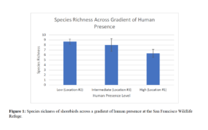
I created a graph to illustrate my species richness of shorebirds data, collected at the three different sampling locations at the San Francisco Bay Wildlife Refuge. These three different sampling locations correspond to 3 varying levels of human presence. Hence, this graph depicts shorebird species richness across a gradient of human presence at the wildlife refuge. I didn’t have any difficulties organizing, aggregating or summarizing this data. The outcome was what I expected in regard to the average species richness of shorebirds across the human presence gradient, however, the results between Location #1 and Location #2 are significant, so I would like to collect some more data to see if significance will be reached with a larger sample size.

Blog Post 8: Tables and Graphs

Getting Microsoft Excel to put all the data I wanted into the graph in a logical way was extremely frustrating. I was not aware that it would be so complicated to format the spreadsheet properly in order to get the proper variables on the proper axes and the right data to be represented by multiple lines. Once I figured out the formatting and how to edit every single piece of the graph to be the right colour and the right line thickness, everything went well. I found that using the combination graph with three axes with different scales was actually not as simple as rearranging the data and using the scatterplot statistical graph for the two quantitative variables. Within this format I could embed two data sets on two lines to compare them in one graph instead of two separate ones, and I could then label the points and lines appropriately within the actual graph or using a legend. I wish there was a way to set a template with all the colours, data point symbols and line designs, so that every time I made a graph I didn’t have to go and change 20 different things in order to make it all look right. I also wish I had the money to pay for Adobe Pro so that I could put the graphs wherever the heck I wanted in my report and wasn’t subject to Microsoft Word’s authoritarian layout rules.

I found some interesting things when plotting the data, but it largely reflected my predictions and hypotheses. When I plotted the data in box plots to identify outliers it largely made up for any discrepancies in the patterns of my original data. I did not expect the elk or deer scat density to be so low in the riparian zone, nor did I expect the deer scat density to be so high in the forest. If I could, I would set up game cameras and see what the animals are up to and how often the deer actually do use the riparian zone. It’s quite obvious from the presence of deer tracks that they are using the riparian area, but for some reason their scat is almost absent. It’s possible the ground is so wet it dissolves, or is engulfed by the muck over time, or maybe they just quickly move through the area to access other feeding areas. One thing that would be worth investigating is whether elk are actually using this area on a yearly basis. If they are, they must cross the Island Highway in order to do so which poses a risk to human and animal life. If there was a way to increase their habitat on the other side of the highway and deter them from crossing into town just to spend a small fraction of time in this small area, then it may be wise to do so.
Blog Post 8

Trail selection by Odocoileus hemionus in an open field at varying snow depths  

Plot  Plot Mean Snow Depth  Individuals Present in Plot  Aggregate Distance Travelled on Established Trail 


Aggregate Distance Travelled on Primary Trail 


Aggregate Distance Travelled on Secondary Trail 


Percent Distance Travelled on Established Trail 


Percent Distance Travelled on Primary Trail 


Percent Distance Travelled on Secondary Trail 
1  37.90cm  8  N/A  189m  51m  N/A  78.75%  21.25% 
2  31.65cm  10  N/A  185m  115m  N/A  61.67%  38.3% 
3  31.60cm  4  N/A  110m  10m  N/A  91.67%  8.3% 
4  30.70cm  7  N/A  165m  45m  N/A  78.57%  21.43% 
5  37.8cm  12  N/A  306m  86m  N/A  78.06%  21.94% 
1  48.52cm  10  267m  0m  33m  89.0%  0%  11.0% 
2  38.27cm  9  222m  40m  8m  82.22%  14.81%  2.96% 
3  38.30cm  2  60m  0m  0m  100%  0%  0% 
4  37.50cm  6  153m  5m  12m  90.0%  2.94%  7.06% 
5  48.28cm  12  N/A  326m  49m  N/A  86.93%  13.07% 
1  65.15cm  11  300m  30m  0m  90.91%  9.09%  0% 
2  55.68cm  8  160m  80m  0m  66.67%  33.33%  0% 
3  55.68cm  4  12m  0m  0m  100%  0%  0% 
4  53.95cm  5  87m  33m  0m  72.50%  27.50%  0% 
5  64.98cm  9  N/A  219m  36m  N/A  85.88%  14.12% 
1  73.10cm  11  290m  40m  0m  87.88%  12.12%  0% 
2  63.38cm  11  226m  80m  24m  68.48%  24.24%  7.27% 
3  63.40cm  3  82m  0m  8m  91.11%  8.89%  0% 
4  62.08cm  8  96m  44m  40m  53.33%  24.44%  22.22% 
5  73.0cm  7  N/A  122m  50m  N/A  70.93%  29.07% 

I did struggle a bit to organize all of the data seen in the above table. This was primarily due to my field notes. My terminology was inconsistent in my notes, and it took me quite some time to go through all my notes and essentially translate them in to something that I could use to create a table. The table really helped clarify the date, in my opinion. Attempting to explain in text the above data would have been extremely confusing.

The outcome was not exactly what I expected, but it supported my hypothesis. There was more use of primary trails than I anticipated, but established trails were still used the most frequently. In table 2 (not shown) the data shows that in warmer weather, and a less dense, melting snow pack, use of secondary trails ceased. Deer ceasing to use secondary trails at a threshold depth was in my hypothesis, but no data that I collected supported this. A further area of study that the data made me think about would be to explore the effects of snow density and penetration through snowpack on mule deer trail selection.

Blog Post 8: Tables and Graphs

I had no difficulties in organizing, aggregating or summarizing my data. The outcome was not what I expected. It revealed that there was little correlation between Douglas fir tree abundance and average tree circumference. However, the relationship between tree abundance and aspect of growth was what I expected. The western aspect had the most Douglas fir trees, while the eastern aspect had the least. My data was collected only over the winter season, I would like to explore any changes that may occur in the abundance/circumference and abundance/growth aspect relationships as seasons and weather change.

Blog Post 8: Graphs

25 March 2020

Shannon Myles


I was having trouble compiling all of my data within only one graph. It seemed as I had too much information to include in the graph. I then decided to combine 4 graphs (A, B, C, D) into my one Figure. By having those four graphs separated but put together in one figure, it was very easy to compare them all. The proximity and arrangement allowed for an easy and quick assessment of all four data that is essentially the same experiment but for four different species. I found that it illustrated well the differences between species. Some basic technical difficulties were met when I was trying to combine all four graphs and axis titles into one figure. I ended up combining them all through PowerPoint into one image that I then introduced into my word document. This technique facilitated the whole process by unifying all my elements.

My data put into graphs actually showed me that there was an increase in flower abundance as one gets away from the beach as I hypothesized. Though, I had not observed the fact that abundance declined within the last two or three subsamples along my transects. This new discovery would definitely be worth studying to understand if perhaps another gradient or ecotone is present as the field gets closer to the highway.

Blog Post 8: Tables and Graphs

At first I had difficulty keeping my field notes, data tables, and field photos organized. Once I decided that I was going to break the study regions up into the sections of trail not adjacent Beaver Lake (‘exterior’ group) and the section of trail with the south side exposed to Beaver Lake (‘Beaver Lake’ group) I remade my field data tables, and collected the data in a much more organized way. After each sampling day, I returned from the field and entered the presence-absence data into an Excel table, so the observations were fresh in my mind. When taking photos, I took a photo of the field sheet (showing the replicate number) so I could organize and refer to my photos accurately for desktop confirmations. I performed desktop lichen group confirmations in 25% of samples collected, as a quality control step in lichen identifications. I had planned before data collection how I was going to aggregate the data into groups.

I arbitrarily chose 25% as the threshold to indicate ‘dominant’ lichen groups. I was surprised to find the distribution of lichen groups were somewhat similar between Cupressaceae and Pinaceae tree families. Interestingly, Pinaceae appeared to have a darker green version (variant or species) within the Cladonia genus, whereas the Cupressaceae were associated with a pale-green (less crinkled edges) species within the Cladonia genus. Also, Pinaceae in the exterior group had the least proportion of visible podetia (development stage of the Cladonia sp.). I am going to review the available information in the primary literature, related to the factors that play a role in the development of lichen podetia.

Blog Post 8 – Tables and Graphs

Blog Post 8 – 19/03/20

Overall the organization of my table went smoothly. There were some initial mistakes made as I tried to correctly tabulate the data; however, I proofread my table and worked hard to ensure that I correctly calculated all the values necessary to complete the information in the table. Aside from the initial minor calculation problems, the organization, aggregation, and summary of my data went well and there were no further difficulties. The outcomes from arranging this table were slightly unexpected. Early on in my data collection I had noticed that white birch  trees were found in higher amounts closer to the central pond. This was confirmed in the table and white birch had the highest distribution in pond land. Surprisingly, white spruce had an relatively even distribution over both central park land and edge land. This was an unexpected result and I will have to look into research previously done that examines the growth abilities of white spruce in a variety of soil conditions. The anticipated result of the experiment was confirmed in the aspen poplar species which had the highest distribution in central park land. This unexpected information from both white birch and white spruce species confirms that I need to study literature investigating ideal soil moisture conditions for growth of both of these trees before discussing my results in my final report.                                                                                                                                                                                                                                                                                                             

Tables and Graphs

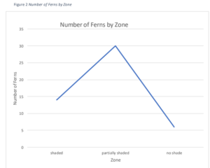
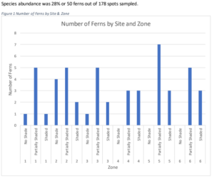
I collected data from 6 sites, Figure 1 shows the number of ferns per site; with each site being broken down into light gradients (no shade, partially shaded and shaded. From  my observations I anticipated that the shaded areas would have the most ferns. This was not confirmed since the partially shaded areas have more ferns.


Figure 2 shows the light gradient going from shaded to no shade. The results show that the partially shaded have the most ferns. The areas with no shade had barely any ferns. There are several potential reasons that the ferns are almost not present in the non shaded areas. Two likely reasons are the ferns preference for wetter shadier areas and the other is that the sites are partially managed. Every several month or years in some sites the non shaded areas which do not have trees have the bushes and other plants cut. I think that after the disturbances ferns are not able to compete with early pioneers such as grasses and thorns.


Blog post 8

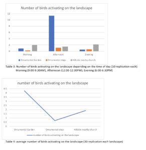
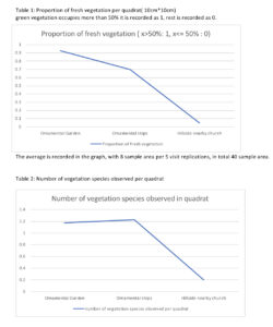
I have made 4 graphs in total to represent my observation for my research project. Graph 1 describes proportion of fresh vegetation per quadrat. The outcome turned out as I expected, the area that had least human management had the least healthy vegetation. While, the area that had most human management had the most healthy vegetation. Graph 2 describes the number of vegetation species found per quadrat. I assumed that there will be the most vegetation species on ornamental gardens and least on the preserved hill and the graph result showed somewhat different results. Ornamental steps had the most various vegetation species per quadrats compared to ornamental gardens yet preserved hill had the least various vegetation species growing in the landscape. Graph 3 describes the number of birds activating on the landscape depending on the time of day (10 replication each). This table demonstrated the bird activities depending on the landscape and time of the day. It was difficult for me to see overall trends of bird activity because the results were showing in so much detail in Graph 3. Therefore with the same data I made graph 4 to represent overall bird activity rate depending on landscape to observe easily. The activity of birds data revealed that did not expect when I started the experiment. I assumed that as ornamental garden had most healthiest vegetation, there would be the most bird activity among the landscape no matter what time in the day. However the results turned out that in the morning and evening the hillside church has the highest bird activities and the ornamental steps were the lowest all the time. This result lead me to a thought that bird activity might not be affected by healthiness of vegetation, instead it might depend on type of vegetations. Further exploration, I decided to study types of species generally found in all the landscapes.