BLOG POST 8

So far I have made two graphs:

  1. The correlation between the number of pollinators and the temperature
  2. The relationship between the number of pollinators and the amount of precipitation (mm)

I think both of these graphs are perfect for showing my data that I have collected. I think my data is all normal, obviously it would be better had I recorded data for a longer period of time.


Post 8: Tables and Graphs

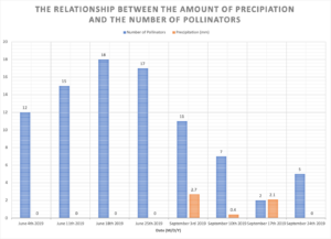
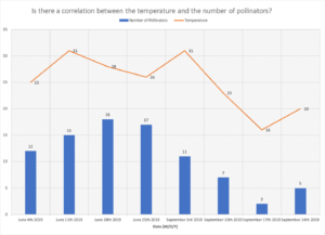
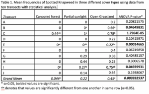
I presented my data summarizing the relationship between mean Canada goldenrod density and level of sunlight exposure in a bar graph. I graphed the mean density (number of plants/m2) as a function of the site along the ecological gradient (low, moderate, and high sunlight). This method allowed me to represent the average value from the 10 quadrats in each stratum, as well as include an error bar to indicate the variance (SE). Additionally, I was able to include the results from my one-way ANOVA and post-hoc Tukey’s HSD test within the figure, by indicating significantly different results with different letters above the bars. The only challenge I had when summarizing my data was converting all density values to a per m2 basis. The data I collected represented the number of plants in a 0.25m2 quadrat. However, I thought presenting it as a more common measurement of number of plants per m2 would be easier to interpret on a graph. As such, I had to convert all of my data accordingly and ensure that my statistical analysis and SE values utilized the same values. 

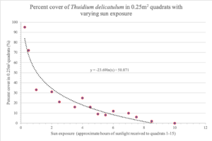
My initial hypothesis was that density would increase with level of sunlight exposure. While my data revealed a significant difference between the mean densities at low and moderate sunlight exposure, there was no significant difference between the mean densities at moderate and high sunlight exposure. This led me to consider the possibility that there is a maximum density that can be supported within a given environment as a result of intraspecific competition. After completing my literature review, I discovered that Canada goldenrod is a very invasive species and exhibits allelopathic effects on neighbouring vegetation. As such, I am curious whether individual goldenrod plants may exhibit intraspecific allelopathy, which limits their density under optimal growing conditions. Furthermore, while the plants in the high sunlight exposure stratum appeared to have a higher density than plants in the moderate sunlight stratum, I found that this was largely due to more growth in terms of height, leaves, and flowering. Therefore, the influence of sunlight on other metrics of plant success presents an interesting topic of study.

Blogpost 8: Tables and Graphs

Organizing my data into my table was not difficult, only time consuming. Calculating mean values was quick and easy but conducting the statistical analysis was time consuming. I definitely had to do further research on the t-tests (and therefore also the necessary F-tests) for determining significance between means after the ANOVA test was completed. While this took time, it made sense in the end and I feel that I’ve presented all relevant statistics by doing so.  The trend that I’ve noticed with the grand mean is that the canopied forest and the open grassland have significantly different frequencies of Spotted Knapweed. The partially lit open canopied forest is not significantly different from either of the other two cover types when looking at the grand mean; when looking at individual transects this may not be the case (see below). It would be interesting to see how these results would compare to a study with more samples to have an even better representation of the frequencies; additionally, it would be interesting to see data from studies of this nature at other sites.

Blog Post 8 – Tables and Graphs

I did not have any difficulties summarizing my data in graphical form. I chose to utilize a bar graph and represent the data as mean number of individual clovers per 1 ft2 quadrant as a function of the level of shade present at each location. The bar graph neatly summarized the abundance of clovers at each location gradient. The graph is easily and quickly interpretable, this is why I chose to use a graph and not a table to present my data. When looking at the graph it is easy to see that it supports my original hypothesis that abundance would be highest in the “no-shade” location. The data did not reveal anything unexpected, however I did think that the abundance in the “partial-shade” would be higher. This has inspired me to consider and explore the effect of anthropogenic influences on the clover growth. I believe that the clovers are less abundant in the “partial-shade” location because the anthropogenic influences create competition for the clovers and introduce disturbances.

Blog Post 8: Graph

I was having trouble compiling all of my data within only one graph. It seemed as I had too much information to include in the graph. I then decided to combine 4 graphs (A, B, C, D) into my one Figure. By having those four graphs separated but put together in one figure, it was very easy to compare them all. The proximity and arrangement allowed for an easy and quick assessment of all four data that is essentially the same experiment but for four different species. I found that it illustrated well the differences between species. Some basic technical difficulties were met when I was trying to combine all four graphs and axis titles into one figure. I ended up combining them all through powerpoint into one image that I then introduced into my word document. This technique facilitated the whole process by unifying all my elements.

My data put into graphs actually showed me that there was an increase in flower abundance as one gets away from the beach as I hypothesized. Though, I had not observed the fact that abundance declined within the last two or three subsamples along my transects. This new discovery would definitely be worth studying to understand if perhaps another gradient or ecotone is present as the field gets closer to the highway.

Post 8: Tables and Graphs

I did not have any difficulties summarizing my abundance data in a simple bar graph, categorized by the three kinds of soil upon which my hypothesis is based. I graphed the relationship between the soil texture at each site along my environmental gradient and the abundance of individual trees sampled. The outcome supported my hypothesis that western redcedar trees would dominate areas of loamy soil that have better moisture-retaining properties than the sandy sites. The bar graph neatly summarizes the presence and absence of the three main species of the area: western redcedar (Thuja plicata), Douglas fir (Pseudotsuga menziesii), and ponderosa pine (Pinus ponderosa). The data did not reveal anything unexpected, but it inspired me to look into why western redcedar was completely absent from the sandy site (site 1) but was represented in the silty site (site 3). This prompted me to research competition between species in the interior cedar-hemlock biogeoclimatic zone, specifically between shade-tolerant and shade-intolerant species. It also inspired me to think critically about the overlapping niches of each species and how their evolutionary history has played a role in the spatial distribution of individuals within a mature stand.

Blog Post 8: Tables and Graphs

Above is the table I submitted for the fifth small assignment submission. It plots the relationship between the percent cover of Common Fern Moss, Thuidium delicatulum, and the degree of sun exposure in my yard. In order to create this graph, I had to measure the sunlight intensity of all quadrats (1-15) for every hour starting at 6:00 am and ending at 7:00pm on July 26th, 2019. Then, I sampled each individual quadrat for percent cover of T. delicatulum. I had some difficulty trying to categorize and separate each quadrat by the number of hours of sunlight received throughout this 13-hour time period. I eventually decided to basically approximate the relative amount of sun exposure received by each quadrat and used these values for the domain of this graph. When I put the graph together, I was very pleased to see that it follows my prediction (minus some outliers). I originally suspected that the graph of these two variables would be inversely proportional, and this graph mimics that trend.  One of the outliers located at point (4,25) really stuck out to me because this quadrat happens to be located in a section of my yard in between the Japanese Lilac Tree and the Columnar Aspen. This area receives minimal sunlight and I recognized the soil in this area to be relatively moist when I was sampling in Module 2. Being that it is too difficult to go about sampling and representing soil moisture with the limited tools and resources I have at home, my best bet in inquiring about this specific observation would be scientific articles on this subject. I am curious to see if there are any scientific articles/studies out there that touch on the relationship between soil moisture and moss abundance. This would help for further exploration and answer a few questions I have going forward.

Blog Post 8: Figures and Tables

I decided to plot the relationship between population density and biomass of white spruces (n=30) that I found in my data. I calculated the biomass of all 10 replicates  for each of the three sites (population density=0.46, 0.11, 0.06) using diameter at breast height (DBH;cm) and height (m), then calculate the mean for each site  and plot it against population density. I originally wanted to plot all the biomass values, however I had trouble figuring out how to graph them due to the nature of my independent value. If I were to group the biomass values in terms of density, I am not sure how I would be able to compare the groups to each other. The outcome was generally as I expected, however it was less linear than I thought it would be. As you can see, my R squared value is only 0.604, so it is not a great fit for my data.

Blog Post 8!

The graph that I created from my collected data was easy to organize, aggregate and summarize. I had the data all laid out for each tidal zone (high, mid and low) therefore, I was able to group together zones and average data which would be more representative for a specific zone. The outcome was similar to what other papers have found but I still predicted that low-tide pools would have greater richness and diversity but this was not the case for all species. The mid-tide zone had more barnacles and also more snails which was not expected but this gave me the idea to look at other papers and they noticed this trend too. The mid-tide zone provides a good environment very similar to the low-tide zone. Making my graph has prompted me to look more into what environmental conditions the thatched barnacles prefer to live in.

Post 8

I would have preferred to display my data in a graph but because there was weak evidence for my hypothesis I felt it would be easier to interpret my data using a table.

I did struggle to collect the correct data for my hypothesis.  After starting the literature review I was able to better understand why some western redcedar trees sunscald after they had been exposed to full sun, but others are able to thrive in full sun.  Western redcedar is not shade requiring but rather shade tolerant, meaning they have adapted to both full sun and shade conditions.  If I had understood the evolutionary fitness process of being able to develop two morphologically and physiologically different leaves (Shade leaves and Sun leaves) I would have set up my plots to study different replicates.

However, the slight increase in light conditions has shown some damage to the foliage on the trees that were adapted to sun exposure which will correspond to my hypothesis.

I would like to further research the ability for shade leaves to recover or adapt to sun exposure.  To date, I have not been able to find any literature specifically related to western redcedar’s ability to recover from sunscalding.  Or does the tree just shed the damaged shade leaves and it’s new growth develop as sun leaves?