Blog Post 8: Tables and Graphs

For my research project, I am studying the correlation between soil moisture and polypore quantity on individual trees. I collected soil samples from the bases of 24 trees: 16 with polypore fungi, and eight without. For assignment 5, I submitted both a graph to depict the data for the polypore-infected trees and a table for the polypore-free trees. Creating the graph for the polypore infected trees was quite simple using Excel. I inserted the x and y values into a table and then converted them to a scatter plot. This process nicely displayed my data in a manner that is easy to interpret.  However, I had a more challenging time trying to create a graph for the replicates without polypores. I struggled with figuring out how to present the data since the response variable was different than the first set of replicates. Since the fungi quantity for all eight replicates is “0”, it did not make sense to present fungi quantity on the Y axis. I decided that the information I wanted to convey for these replicates was soil moisture and whether or not they were clustered near polypore-infected trees (a simple yes/no variable). Since I could not figure out how to best graph this, I opted to create a table for this set of replicates. I will still play around with the data to see how best to display it for the final report.

The data was surprising to me as no clear patterns emerged between soil moisture and bracket fungi quantity per tree. I was hoping to see a clear trend wherein the higher the moisture content in the soil, the greater number of visible brackets on a tree. Similarly soil moisture was just as variable for the trees without bracket fungi, as many trees in very moist environments did not have any fungi. This has given me a lot to consider for further research which I will discuss in my final report. Variables such as (but not limited to) polypore-infected tree density, slope, canopy cover, soil pH, proximity to the watercourse, diameter at breast height and age of the trees could also impact bracket fungi quantity, and would be worthy of further exploration.
Blog Post 8: Tables and Graphs

My study hypothesis was that the Broadleaf Stonecrop abundance is determined by substrate drainability (i.e most abundant in sites with either a high rate of water percolation or surface runoff). To demonstrate the results of my study, I plotted three graphs; one showing the relationship between substrate type and stonecrop abundance, one showing the relationship between degree of slope and stonecrop abundance, and a third showing the level of drainability and stonecrop abundance. 

The first two graphs depicted strong relationships between stonecrop abundance and both substrate type and degree of slope individually.

The most difficult part was assessing the level of drainability within each quadrat as it combines the effects of two variables, slope and substrate type. A high degree of slope is going to increase surface water runoff, while a coarser grained substrate is going to increase the rate of percolation, both of which lead to a higher rate of water being drained from the area.

My graphs generally agreed with my hypothesis and demonstrated that the abundance of Broadleaf Stonecrop responds positively as water is drained faster from the substrate. My results also demonstrated that there are other confounding factors, as to be expected, that are also determining the abundance of my study subject. I had established four levels of substrate drainability, and predicted that the well and rapid draining sites would have the highest abundance of stonecrop, however my results indicated that the well draining sites in fact did not have the predicted response. It was later suspected that this is due to another factor, proximity to the ocean, as the majority of the well-draining quadrats were found to be facing the lagoon, as opposed to open ocean.

Post 8: Tables and Graphs

I had a hard time inserting my data onto a graph as my numbers were a little strange and I had multiple data points with the same x and y-value. I initially thought I would use a scatter plot but after trying that in Excel, I realized it looked quite messy and the data was difficult to understand. So I decided the best way to illustrate the patterns in my data would be two bar graphs that show the means of soil moisture and the means of number of ferns for each transect. I felt the trends in my data were much easier to understand this way. Although I only submitted the bar graphs figure for Small Assignment 5, I think I may also use a table in my paper to insert the specific data from each quadrat.

Based on my bar graphs, I could clearly see that both Transect A and C had similar levels of soil moisture, but Transect A has a much higher number of ferns than Transect C. Furthermore, although Transect B was the most dry, it had a similar number of ferns to Transect C. This outcome is not what I expected as I had hypothesized that as soil moisture increases, the number of ferns would also increase. I will have to consider other factors that may contribute to this pattern while writing my paper, including shade, degree of slope, and soil pH.

Percy Herbert, Blog Post 8: Tables and Graphs

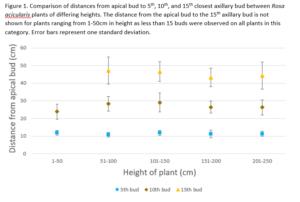
I have collected all of the data for my study on wild rose axillary bud spacing. I generated a figure for Small Assignment 5 to visualize key data. This figure displays plant height (the predictor variable) on the x-axis and the distance from the apical bud to the axillary buds (response variable) on the y-axis.

I originally had planned to show the distances for all 15 buds in the figure for each plant height category. I discovered that when all of this data was included the figure was messy and hard to interpret. By reducing the number of buds displayed to 3 (the 5th, 10th and 15th bud) visualization of the data points and error bars in clear. The inclusion of the data from the 5th, 10th, and 15th bud is a good representation of the full dateset and is sufficient to provide an appropriate visualization. The data from the other buds not represented in this figure may be displayed in a table in the report.

The creation of the figure provides supportive evidence for the prediction that axillary bud spacing is consistent regardless of plant height. The figure shows that at the 5th, 10th, and 15th axillary bud, the distance from the apical bud is easily within one standard deviation for all plant heights and no clear trends are displayed. These results suggest that there is an optimal spacing between the axillary buds for wild roses. For future research it would be worthwhile to further investigate what features have been optimized in wild rose crown architecture and what factors influence these features. For example I would like to investigate leaf size and location to measure the extent of self shading.

Blog Post 8: Tables and Graphs

At this point, I have completed the collection of all my data. In the Small Assignment #5, I have made some graphs using the data I collected from the field (garden) for this experiment.

My graph demonstrates the relationship between the number of other types of plants growing in 30 cm from each bean plant (sample plant), and each individual plant’s growth estimated using its leaf and bean pod numbers. Each graph is a representation of sample data from one garden bed. While summarizing my data, I did not have any major difficulties, but it rather helped me to see if really there was a correlation between both the independent and dependent variables. It also helped me to eliminate one row of data recorded from when I collected data, in which all numbers were 0, except for only one sample, in which there were 6 flowers per bean plant.

Referring back to my hypothesis, which involved determining whether the presence of other plant species growing near an individual bean (Phaseolus vulgarus) plant contributes to its growth and abundance. When I did the experiment, I was looking forward to understanding whether greater diversity in garden plots would reduce the intraspecific competitions; therefore, leading to larger bean plants. However, the results obtained from the experiment, were unexpected, as I anticipated a positive relationship between the growth of the bean plant, and diversity of plants near it. Some of the results indicates a negative correlation, others weak positive correlation, and the rest show no correlation. This opened my mind to further explore the effect of greater diversity of plants in the same garden bed, or in a close area. I also want to explore the effects of interspecific as well as intraspecific competition. I wonder if either ever favours the growth of bean plants, or if there are perhaps other confounding variables that might be leading to the bean growth and abundance. Finally, I am looking forward to comparing my research results with other results from literature, as I continue to write my report.

Blog Post 8: Tables and Graphs

For my figure, I used Excel to create a bar chart representing mean percent cover for each of the three stratifications of my study area. I used error bars to depict standard error and tried to keep the visuals as simple and clear as possible.

I am fairly well versed in Excel, so I didn’t run into too much trouble with creating the figure. I was surprised to see my data line up quite well with my prediction. I have yet to conduct statistical analysis of the data, so it remains to be determined if my results are significant.

Reudink, Post 8: Tables and Graphs

For my project I wanted to see if (a) Populus alba density was correlated with soil moisture content and (b) if P. alba density was different between my measured transects. I compiled my data into a table and also made a few figures. The table was made simply with excel and then I imported the excel sheet into R as a .csv file to make a few figures. I have never been great at using R or excel, but with help of a few YouTube videos and forums I was able to figure out the input required to make the graphs I wanted. My biggest difficulty was ensuring that all of the labels on my graphs were correct.

The outcome of my data was surprising because there was (a) a NEGATIVE correlation between P. alba density and soil moisture content and (b) There was a linear increase in P. alba density from the east transect to the west. This is most surprising because there is a dyke on the west side, so one would think that the soil moisture would be highest closer to the dyke (westward), but the results showed the opposite. This strangeness prompted me to further investigate whether sampling error was a large contributor to this. I am not well-versed in using R to fit data to a model, but I know what normal distributions are supposed to look like on histograms, so I mapped my data onto histograms and analyzed for normality. None was found in my soil samples, so I’m chalking this up to sampling error and would recommend further investigation at a drier time of the year to detect how soil moisture is related to P. alba density. I have attached a word doc of all my figures and tables I will be using for my final report.

Figures and tables for final report

Blog Post 8: Tables and Graphs

My project involves looking at the surface density of springtails (Collembola) in response to the presence or absence of cover. The data collection consisted of counting individual arthropods on the snow surface within 10 quadrats in two treatments (5 each), three times a day, over the course of five days. So though I had 150 data points, I organized them into 10 rows (corresponding with the quadrats) and divided the data up into columns according to their respective categories (date, time of day, treatment) in Excel and found this visually easy to manage. However, trying to analyze these data points in Excel was not as straightforward, partly because I’m no expert at Excel as a data management tool, and partly because “visually easy to manage” seems to be more of an endpoint of data analysis (the table or graph) rather than a starting point of data management. My “data whiz” friend informed me that data input is easiest to manage when each data point has its own row (in my case that meant 150 rows) and is only located in one column, and to try to ensure that the rest of the data (treatment, date, time-of-day) is specific to its own column – even though that means that the values within these cells would get repeated. This information allowed me to at least partially understand the way a program like Excel reads data, and I began to see how powerful a tool it can be to process, analyze, and display data, especially when datasets are large.

The graph I produced with Excel showed me that there definitely was a trend in my data, possibly a significant one. Though I need to run a p-test to see if I can reject the null hypothesis (the standard error bars between treatments appear to almost overlap), there certainly appeared to be a springtail preference for full sunlight rather than cover. This is the opposite to my prediction of a preference for shade based on observation, as well as the shade preference seen in the results of certain experiments done in the literature (Salmon and Ponge 1998). However, upon further researching this fascinating order of arthropods, I’ve come to understand that there are over 5000 species, some of whom live their lives totally subterranean, some of whom live in surface layers of soil and organic matter, and some of whom live above ground and with a multitude of life strategies and abiotic tolerances (Hopkin 1997).

The small graph I was able to generate from my data reveals to me that my experiment would most certainly be improved with more replicates done over a greater time span and in different habitats. Having more expertise at species identification and sampling in different habitats would also provide more robust scientific knowledge to the ecology of Collembola, as different species likely have different preferences for light and darkness depending on life events that may be occurring at different times throughout the winter (rearing, migration, reproduction etc.).


References:

Hopkin, S.P., 1997. Biology of the Springtails (Insecta: Collembola). Oxford University Press, Oxford.

Salmon, S., Ponge, J.F. Responses to light in a soil-dwelling springtail. European Journal of Soil Biology 34: 199-201.

Blog Post 8: Tables and Graphs

For the small assignment on tables and graphs, I made a table comparing the gravimetric soil water content of sites with and without cedar trees. To do this, I used basic statistical analysis, including the minimum and maximum value, mean, median, and standard deviation.

I would have liked to put this data in a graph, as I think that would have displayed the data better. However, upon a preliminary search of how to do logistic regression graphs, I quickly realized that this was far out of my current level of comprehension. This produced the difficulty of having to put everything that would be represented in this type of graph in a table. I don’t think I fully achieved this, as I ended up leaving out all the separate data that I collected to keep the table simple and easy to read. I am currently brainstorming other methods that will fully represent the data for my final.

The outcome was what I expected, although not to the same magnitude. The mean for the results from sites with cedar trees was 52% compared to 41% for sites without cedar trees. I was expecting the soil to be more moist in the sites with cedar trees by about 20% as opposed to 11%. Foolishly forgetting that I live on the “Wet Coast”, I was also expecting both values to be lower overall.

It was interesting that the data from the sites with cedar trees had a fairly higher standard deviation than the ones without cedar trees. This may mean that other factors are affecting the soil moisture on sites with cedar than that aren’t affecting the sites without cedar trees. These other factors could be further explored in the future by doing a study focused on sites with cedar trees.

Blog Post 8: Tables and Graphs

After entering my data into excel I found that it was difficult to display the data as a whole without breaking out the separate data sets gathered. Since I had gathered information on predators and a separate group of data on prey, I had to find a way to display this in a way that showed the relationship. Eventually I settled on the average of the number of signs of predator activity and also the average number of signs of prey activity.

The result in graph showed an immediate trend between the two, and I was pleasantly surprised to see how clear the relationship was. However, I also had to reconcile that I had gathered only a single weeks worth of data from 35 point counts (Conducted each day). While there was a lot of separate data to draw from I realized that a longer term study over a month or two in less areas may have given my data more weight and allowed me to see a more longer term trend such as is predicted in Lotka-Volterra models.

Overall, even with a shorter time duration of data gathering, I came away with a better understanding of why long term studies really hold alot more weight than shorter duration studies.